Nightline Kopenhagen (2020)
Concept, Design & Realisation
Sfgb-b
Nightline Kopenhagen
(2020)
Concept, Design
& Realisation
Sfgb-b
Nightline Kopenhagen
(2020)
Concept,
Design
& Realisation
Sfgb-b
Nightline Kopenhagen (2020)
Concept, Design & Realisation
Sfgb-b
Nightline Kopenhagen (2020)
Concept, Design & Realisation
Sfgb-b
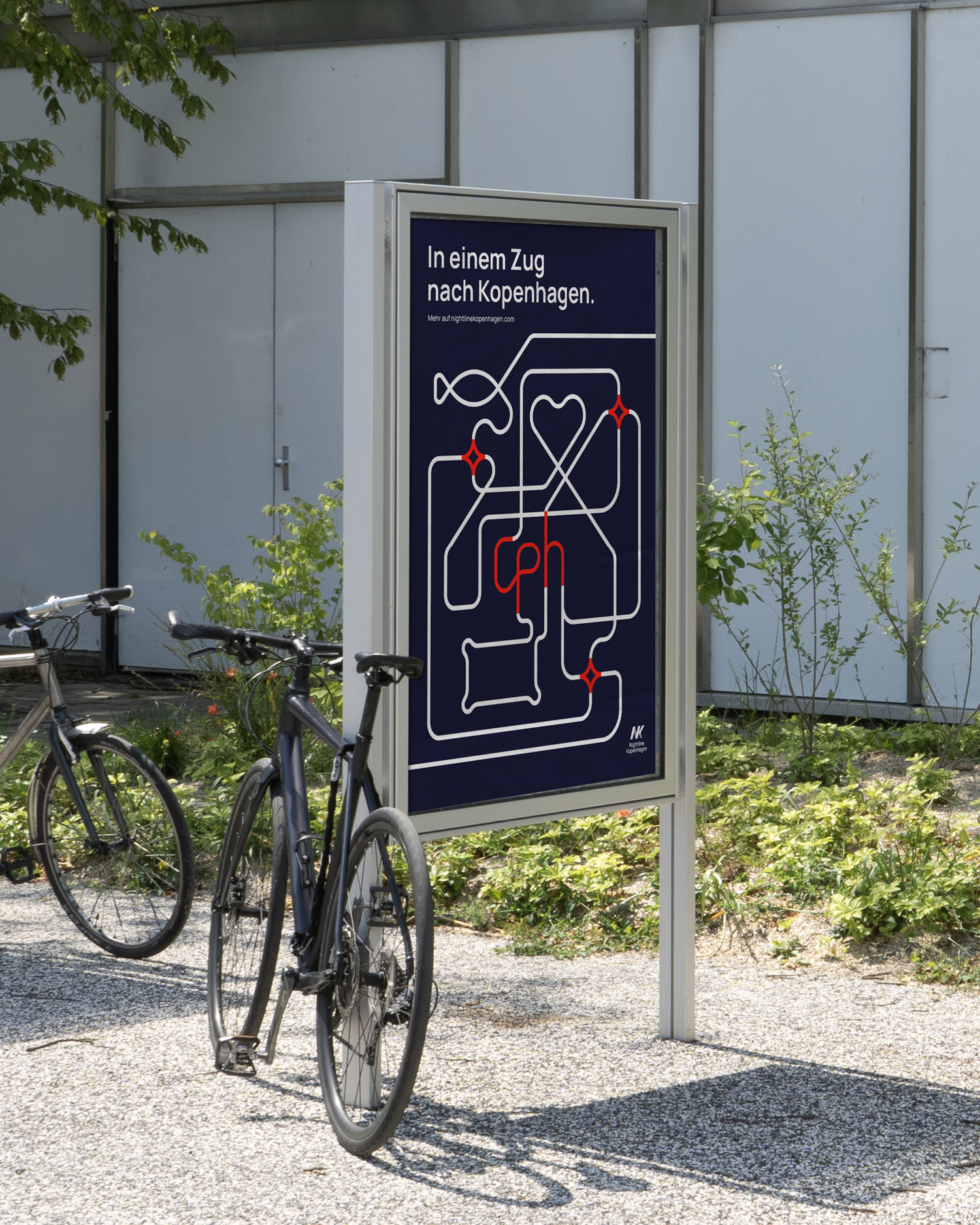
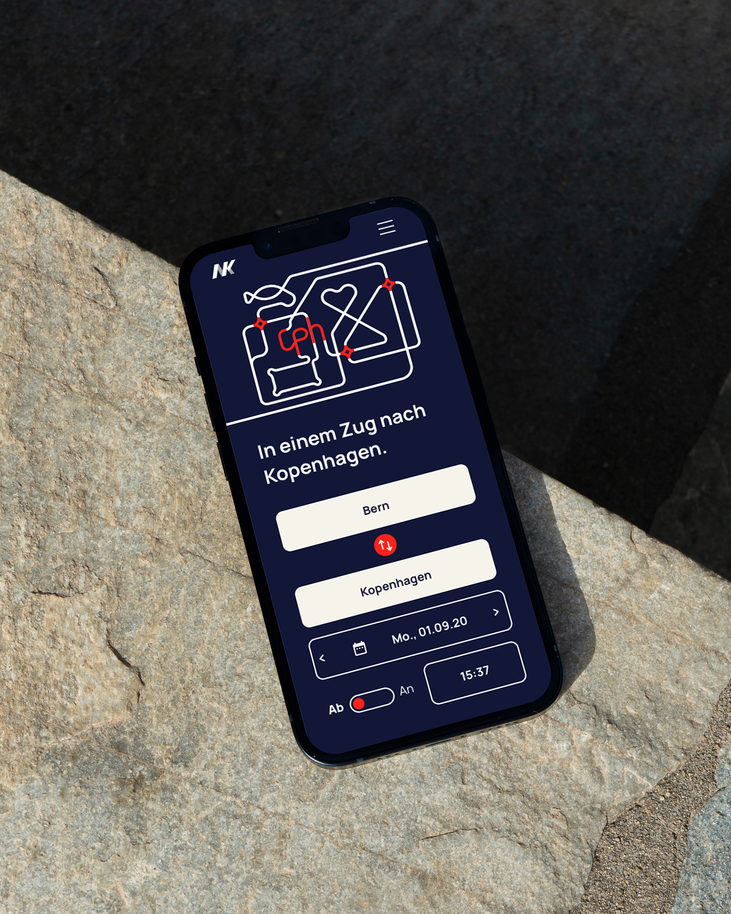
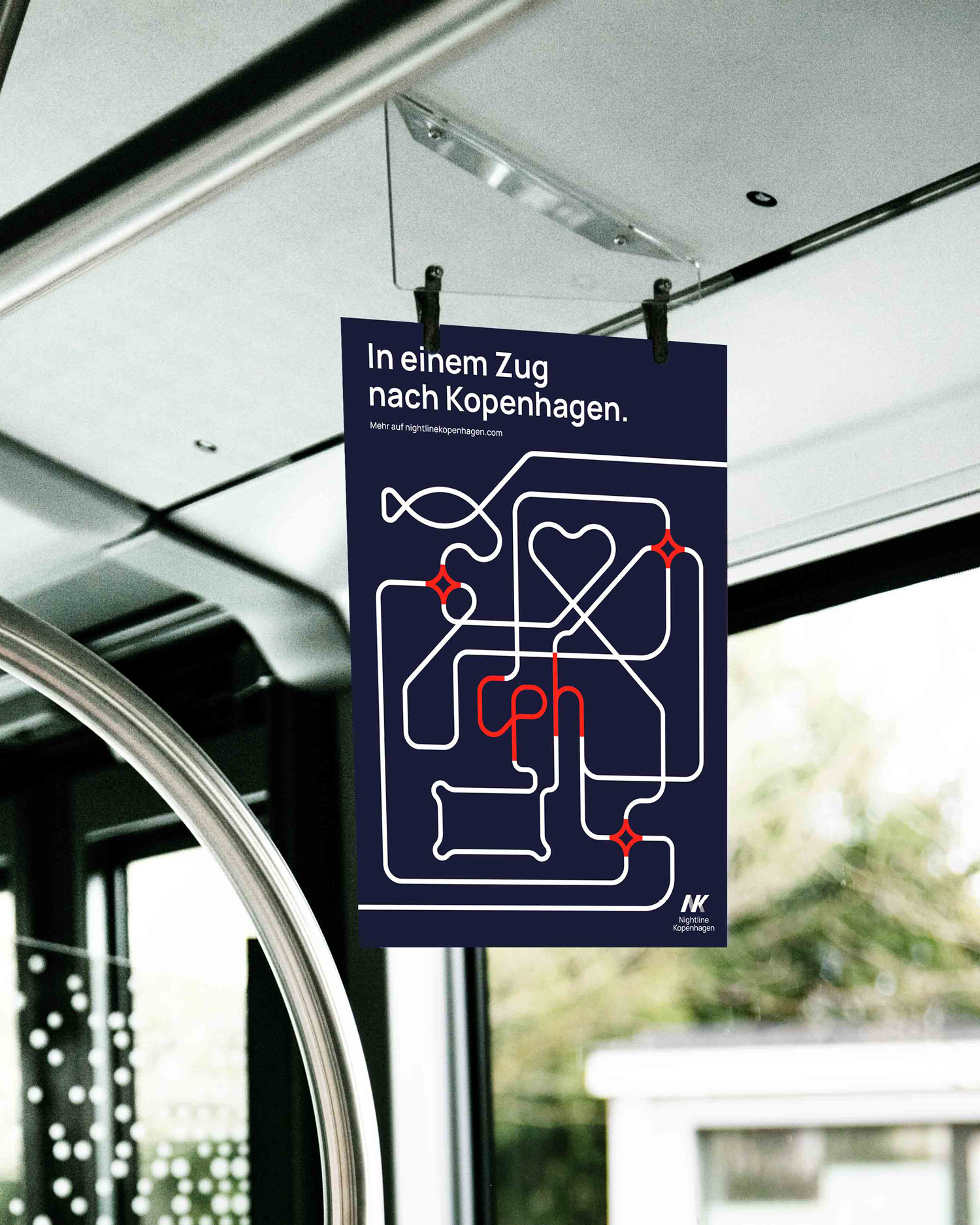
The diploma project was centred around the theme Night Train, with Madrid, Vienna and Copenhagen as possible destinations. Drawn to Nordic design, I chose Copenhagen. The brief was to conceptually develop and fictitiously realise a brand design and campaign that captures the character of the city and makes it visually recognisable.
The visual concept draws inspiration from railway networks, using a system of symbols that reference Copenhagen. A heart symbol represents hygge – the Danish concept of comfort, warmth and well-being. A fish stands for Copenhagen’s rich culinary culture, balancing playfulness with a sense of movement and dynamism.
The design is built around the slogan „In einem Zug nach Kopenhagen“ (“With one train to Copenhagen”), a linguistic play that can be read both as being on a direct train to the city and as travelling without the need to change trains.